Loon Fung
Rejuvenating the cultural brand for an east and west audience
London’s oldest supplier of Asian food, Loon Fung, was losing out to competitors with a stronger brand presence. Household was asked to design a new brand identity to appeal to a mainstream audience, while preserving Loon Fung’s authentic cultural credentials.


To express the vibrancy of Asian food culture in an identity that is accessible to everyone, we defined a new brand philosophy.
We evolved the key brand assets of the male Dragon and Chinese Phoenix icons to feel more contemporary while retaining their crafted heritage. The perfectly balanced icons playfully chase each other in the brand marque, representing the business founders and their equal partnership in business and marriage.

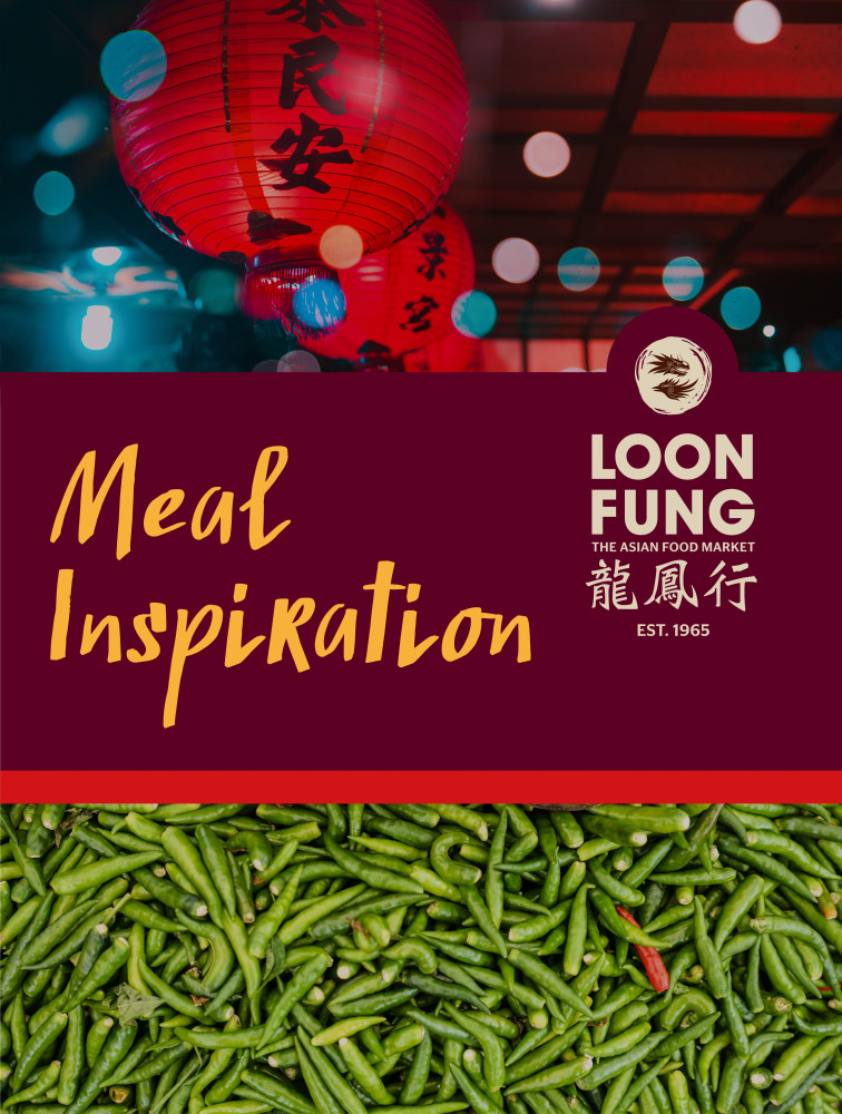
To position food and flavour at the heart of the brand’s identity and evoke the warmth and vibrancy of the Modern Far East, we selected a colour palette of bright Chilli Red and deep Date Red. As white is considered unlucky in Chinese culture, the reds are contrasted with traditional porcelain Rice.


Colour palette expresses
food and flavour


